
Case study
Onsa
Innovative and easy-to-use blockchain financial productPROBLEM
More and more people are investing these days. Most people are using mobile payment services.
Investment can be hard and complicated to start.
User have to make multiple transactions to send money to several peers.
More and more people are investing these days. Most people are using mobile payment services.
Investment can be hard and complicated to start.
User have to make multiple transactions to send money to several peers.
RESEARCH
01 Competitive Analysis
After understanding product goal of our clients, we started by gathering different examples of how other apps are doing in current market, and analysing the users through the survey
![]()
02 Survey
Survey Questionary
![]()
03 User Analysis
![]()
![]()
![]()
01 Competitive Analysis
After understanding product goal of our clients, we started by gathering different examples of how other apps are doing in current market, and analysing the users through the survey
02 Survey
Survey Questionary
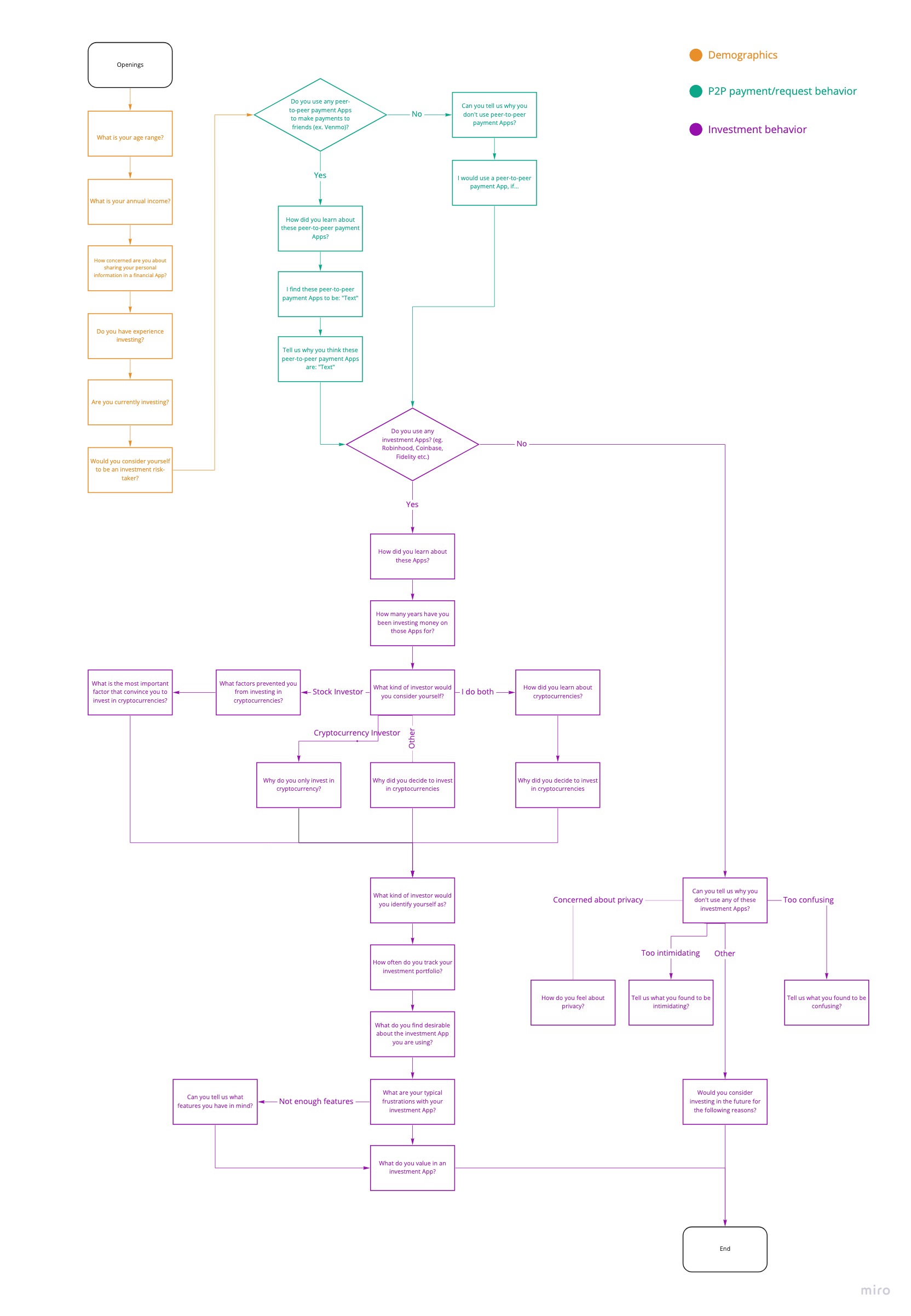
03 User Analysis
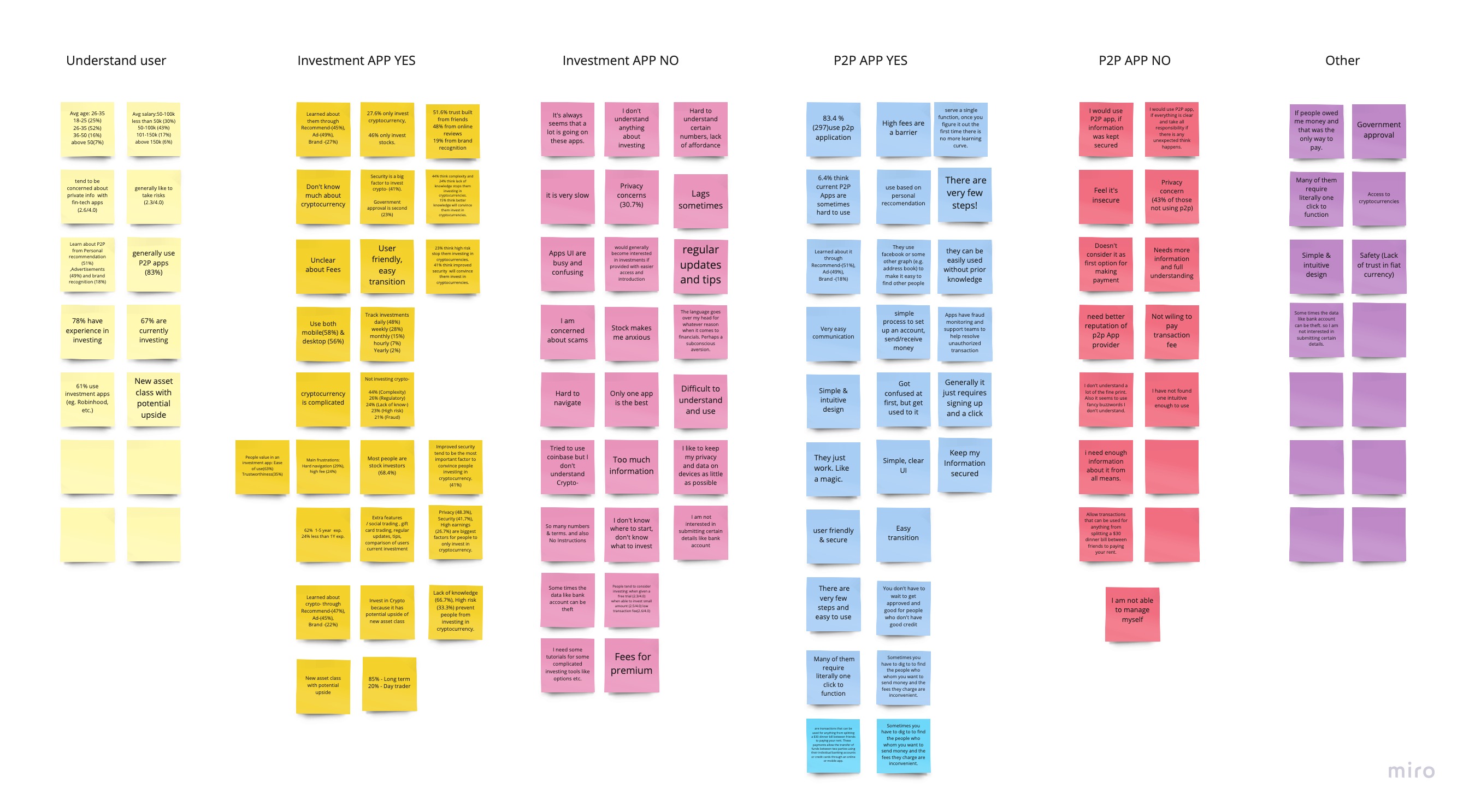
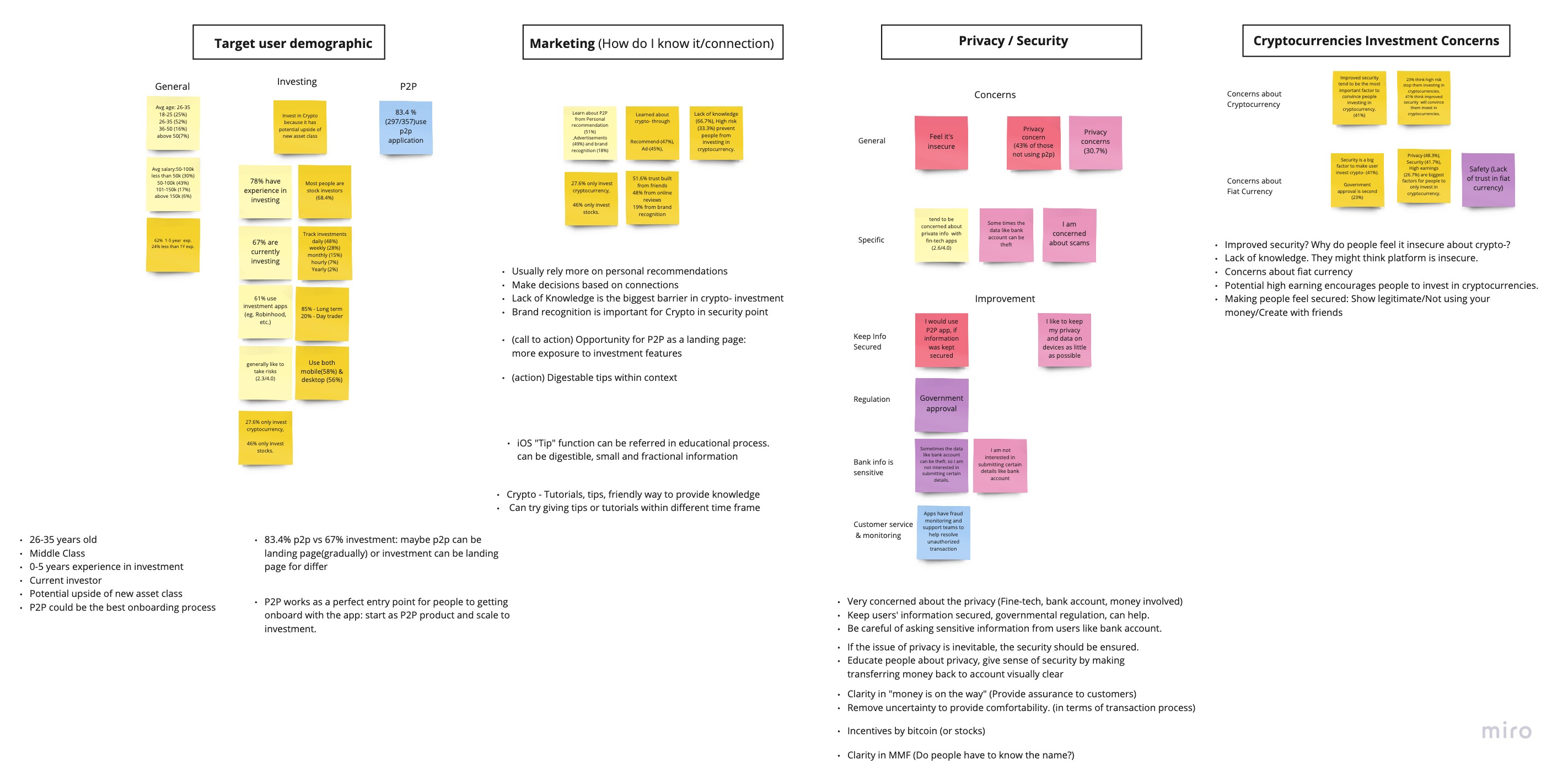
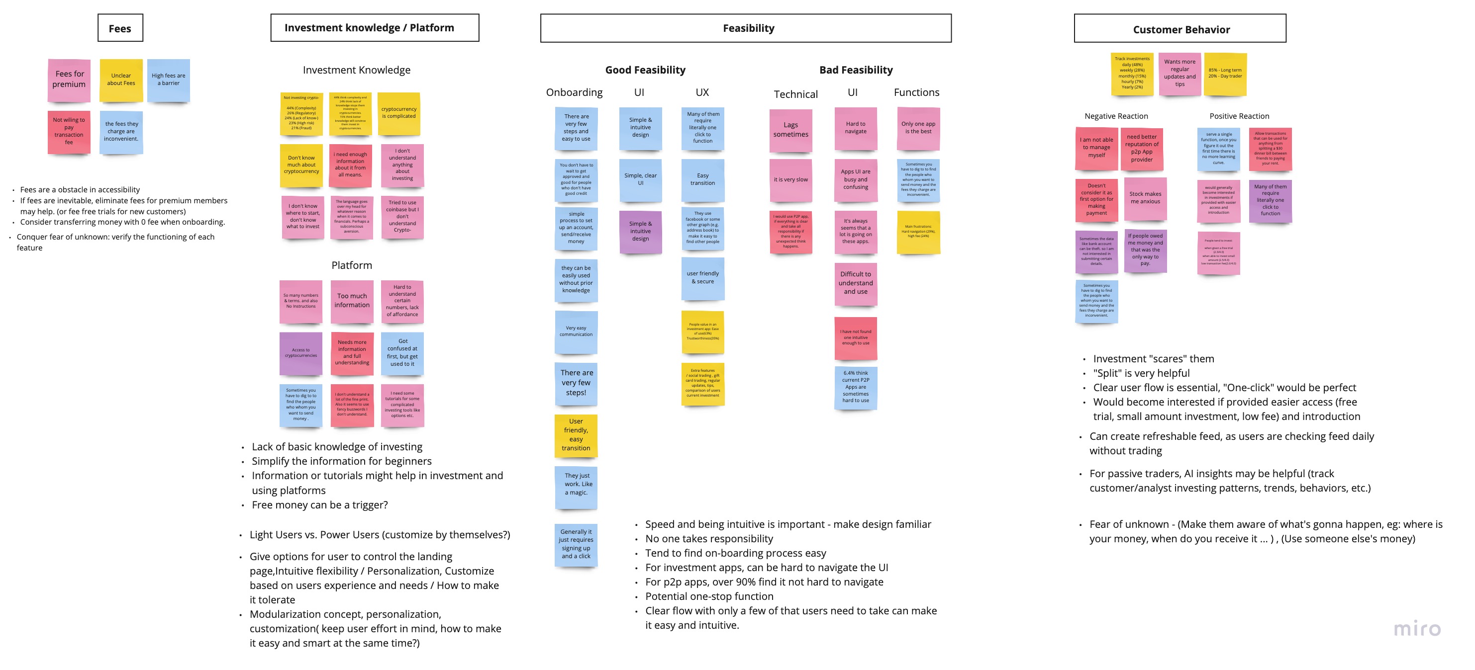
MEET THE USER
We started by conducting user survey, and by analysing the users from 360 responses, we were able to find out
We started by conducting user survey, and by analysing the users from 360 responses, we were able to find out
Users
26-35
Users are mostly 26 - 35 years oldTrust worthy
Mostly introduce to new financial tools by their personnal connections
Investment
67%
of user use investment application
Concern & Obstacles
67%
of user use investment application27.6%
Only 27.6% invest in cryptocurrencyConcern & Obstacles
Privacy & Transaction Fee
Peer to Peer
Needs
Suggestion
83%
of user use Peer to Peer transaction applicationNeeds
Split function
Suggestion
One click function
TARGET USER
Based on the research we set our target user as
Demographic
26 - 40
Age range of 26 to 40
People who is in middle class bracket
Familarity
Mobile transaction
People who use peer to peer transaction services, familiar with mobile transaction
Mobile transaction
People who use peer to peer transaction services, familiar with mobile transaction
Personnal experience and goal
Starter and Pro investor
Have experience of 0 - 5 years in investments who wants to start on investing or currently investing
After validating the users from our research and survey,
we continued to build up the structure of our product and possible user flows under different scenarios
DESIGN GOAL
Design ‘innovative and easy-to-use blockchain financial product based on Fluidity’
Design ‘innovative and easy-to-use blockchain financial product based on Fluidity’
Intuitive
Create clean simple user interfaceHumanistic
Friendlier experience, Personalized optiotnsFluidity
Makes money fluid, Allow user to be fluidINTUITIVE
CLEAN, SIMPLE USER INTERFACE
As our product is financial product with lots of complicated informations
we aim to design clean, simple user interface and to avoid overwhelming users.
HUMANISTIC
Friendlier, humanized experience in using complicated financial product
CONVERSATIONAL AI
With conversational style onboarding with AI, user will get friendlier and humanized onboarding experience
during long, complicated process with lots of varifications
VISUAL INDICATOR
Allow user to track every stage in onboarding process and to encourage user to finish the process without losing the track
Visual Indicator in onboarding
INTERACTION
Scrolling up and down interaction based on Fluidity
MAKE MONEY FLUID
Transfer any financial assets to another
ALLOW USER TO BE FLUID
Flow in between complex financial markets
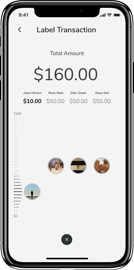
Scrolling up and down thumb Interaction based on Fluidity
PERSONALIZATION
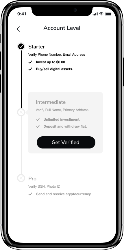
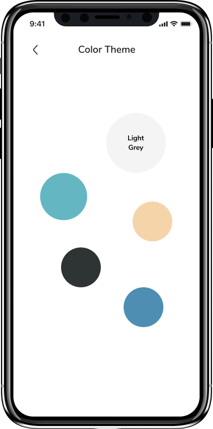
Personalization option depend on users’ experience and goal of using our product
Investment
Starter - Intermediate - Pro version under users experience in investment
Interface
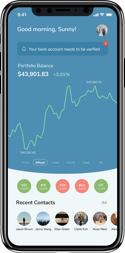
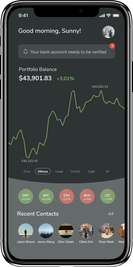
Different color theme options under each users preference
DESIGN DEVELOPMENT
In developmenet stage, I focused on Peer to Peer transaction, User Interaction, and visual design
PEER TO PEER TRANSACTION
Meet the users needs of ‘Split’ payment and request
From user research, most of users needs were to send / request payment to multiple user in single transaction. So we create ‘Split’ payment and request function based on fluidity.
Meet the users needs of ‘Split’ payment and request
From user research, most of users needs were to send / request payment to multiple user in single transaction. So we create ‘Split’ payment and request function based on fluidity.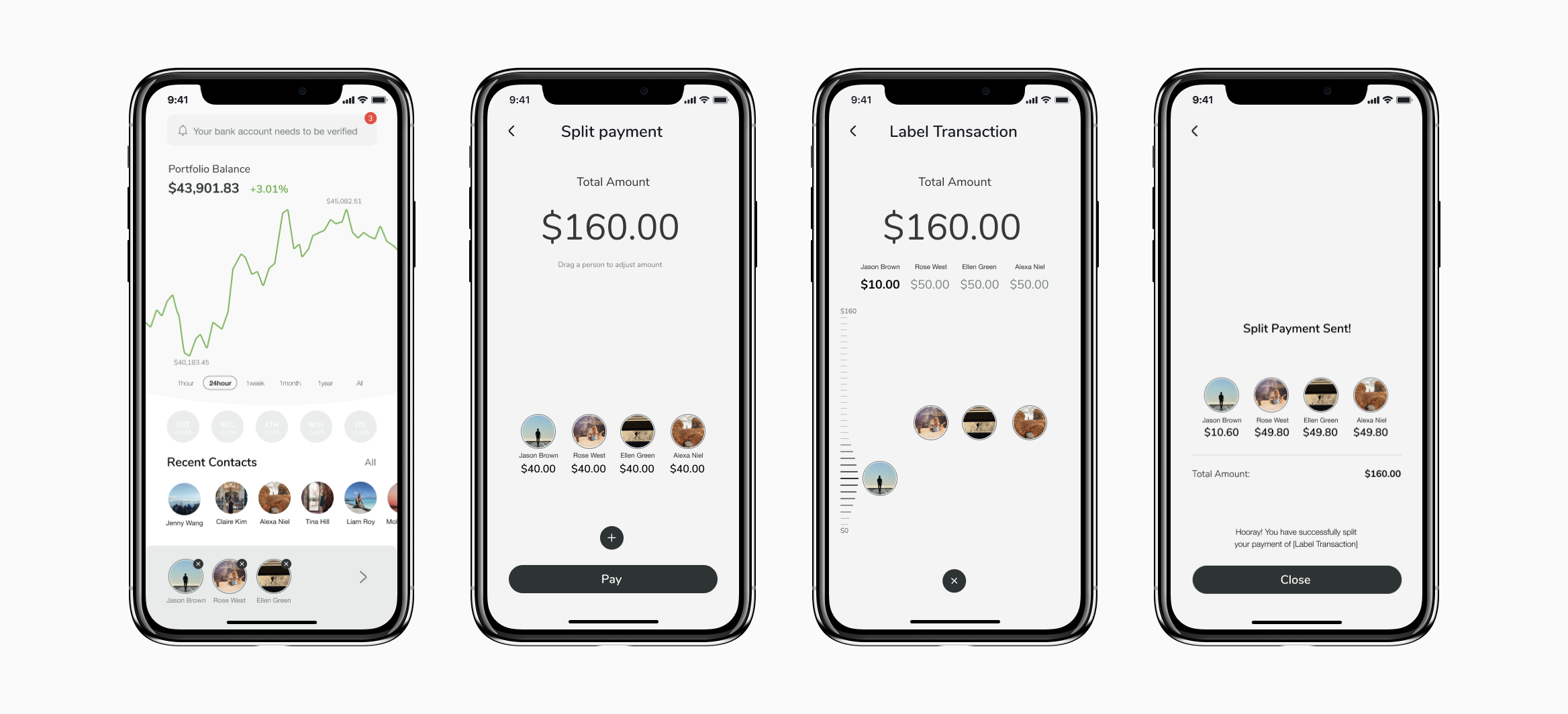
USER INTERACTION
Thumb interaction in peer to peer transaction and token trading
SCROLL UP AND DOWN THUMB INTERACTION
Option 01
![]()
Option 02
![]()
Scroll up and down
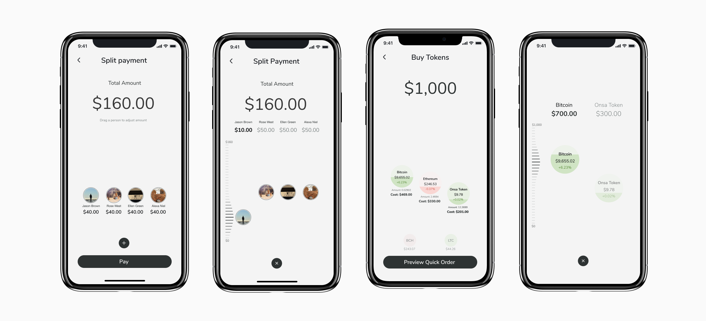
Tap to Activate, Scroll up and down to adjust the amountPress, hold and move
Press and hold to Activate, Change the portion of the wheel to adjust the amountDESIGN DECISION
By considering easier and intuitive interaction to Fat thumb user (Usability) and allowing fluid transaction by aligning with Fluidity, we decide to create Scroll up and Down interaction
VISUAL DESIGN
VISUAL INDICATOR IN ONBOARDING PROCESS
As our product is financial product requiring lot of informations and verification process, we aimed to design user friendly onboarding process by allowing them to track on every steps of onboarding, and to encourage them to finish the process without losing the track.
Four different colors of indicator
4 steps in onboarding process
01 Create an account (Blue) - 02 Link Bank Account (Red) - 03 Verify Identity(Green) - 04 Final steps (Yellow)
Empty grey indicator will be filled one by one, following the process of user completing each steps of onboarding
Two different sizes of indicator
Large indicator
One large circle represent one step of onboarding process
Indicators will be filled with colors when user completed each steps of process
Indicators will be filled with colors when user completed each steps of process
Small indicators
Smaller indicator represents seperated small steps under each 4 steps
When small indicators are all filled up, it leads to fill one large indicator
When small indicators are all filled up, it leads to fill one large indicator
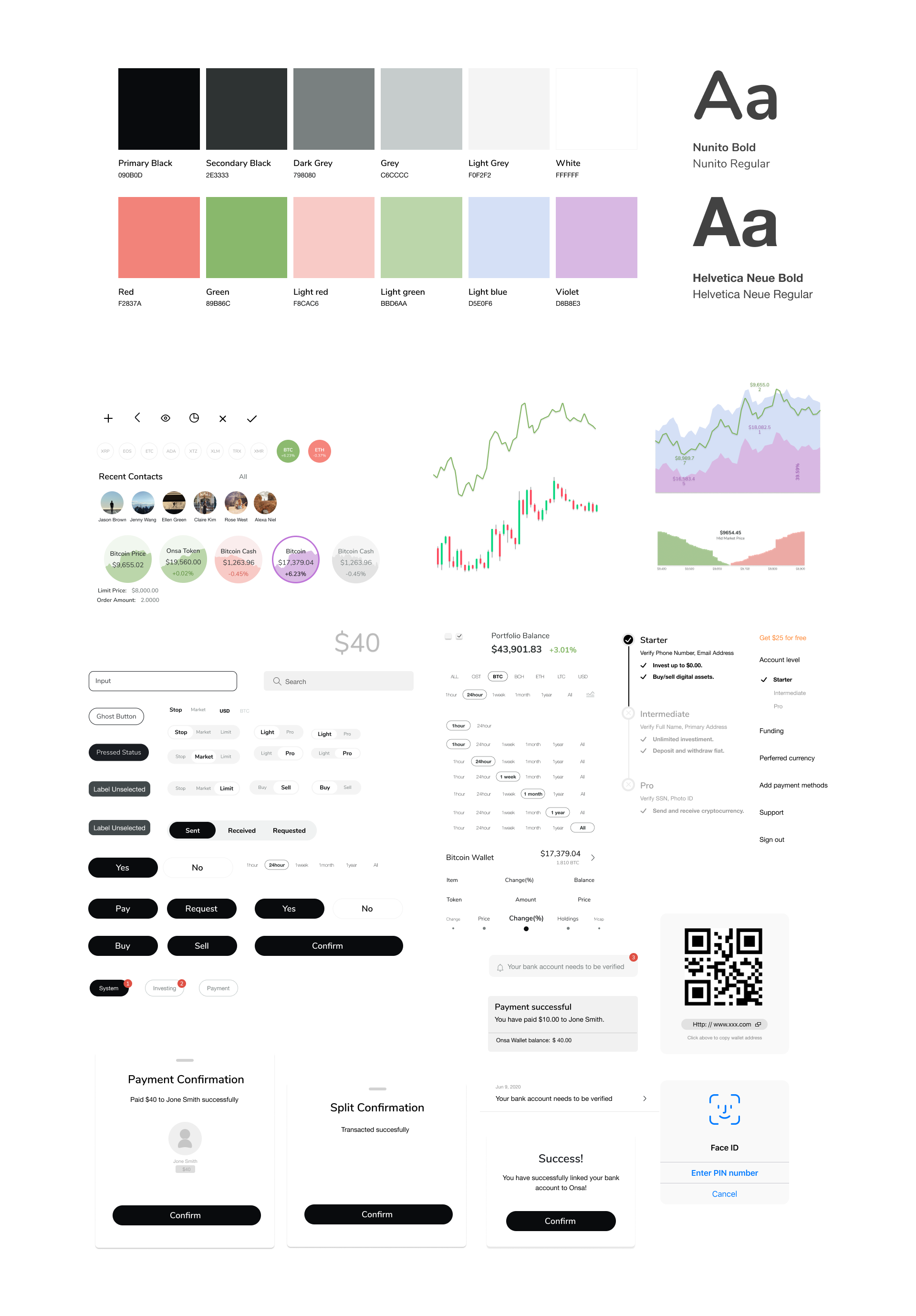
DESIGN SYSTEM
DESIGN ITERATION
After user testing and user feedbacks, we have several versions of variation on our design
01 Landing page
BEFORE
Card portfolio chart Starting from ‘My portfolio’ card, Different tokens portfolio balance are shown in one of each cards, User can swipe ‘right’ to see different tokens portfolio
Card portfolio chart Starting from ‘My portfolio’ card, Different tokens portfolio balance are shown in one of each cards, User can swipe ‘right’ to see different tokens portfolio
AFTER
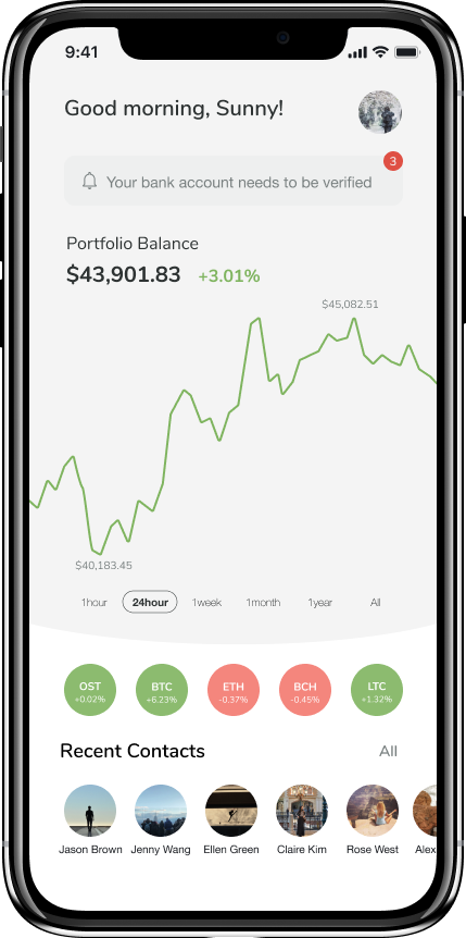
Full screen UI
Portfolio balance chart in full screens, Placing differnt tokens under the charts
Full screen UI
Portfolio balance chart in full screens, Placing differnt tokens under the charts
02 Notification
Version 1
Notification on users profile icon
Notification on users profile icon
Version 2
Notification on users profile icon
Notification window of icons
Notifications distributed under each feature
3 different icons - Investment, P2P, general notification
Notification window of icons
Notifications distributed under each feature
3 different icons - Investment, P2P, general notification
FINAL
Notification on profile icon
Notification window of informations
Giving the most recent notifications
- User can get most recent information without taking extra steps ( Clicking each icons)
Notification on profile icon
Notification window of informations
Giving the most recent notifications
- User can get most recent information without taking extra steps ( Clicking each icons)
03 Placement of numerics
![]()
The amounts for each peers are evenly distributed automatically, and users will be floating in the middle of the screen as a loading status
The amounts for each peers are evenly distributed automatically, and users will be floating in the middle of the screen as a loading status
BEFORE
Numeric placed under the avatar Amounts of distribution and names under users’ avatar
It was hard to see the instant changes in numerics, as it was hidden by users thumb
Numeric placed under the avatar Amounts of distribution and names under users’ avatar
It was hard to see the instant changes in numerics, as it was hidden by users thumb
AFTER
Numeric placed on top of the avatarAmounts of distribution and name on top of users’ avatar
User can see the changes of numeric instantly while their scrolling up and down
Numeric placed on top of the avatarAmounts of distribution and name on top of users’ avatar
User can see the changes of numeric instantly while their scrolling up and down
04 Currency
OPTION A
Card UI User can see and change to different currency option by swiping left and right
Card UI User can see and change to different currency option by swiping left and right
OPTION B
Letter currency
To let users see all currency option at once, we decided to use simple styles
in currency
Letter currency
To let users see all currency option at once, we decided to use simple styles
in currency
05 Scale
![]()
BEFORE
Static scaleScale on the left work as a guide when user are adjusting the amounts of distribution.
Initial thoughts - Scale at the background can work as a guideline when user are adjusting the amounts
Static scaleScale on the left work as a guide when user are adjusting the amounts of distribution.
Initial thoughts - Scale at the background can work as a guideline when user are adjusting the amounts
AFTER
Responsive scale Scale will only appear when avatar is activated for when user activates the avater for adjustment
Development - Responsive scale which appears when avatar and token is activated.
As our produt is full of complex informations, we tried to find the way of keeping interface simple and clear as possible.
FINAL DESIGN
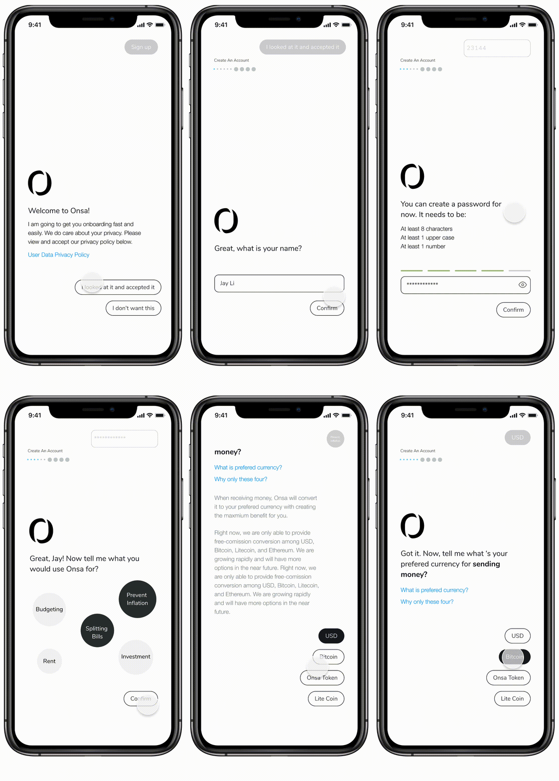
Onboarding with Conversational AI
Onboard with Conversational AI
Visual indicators in different colors each steps of onboarding process
Intuitive, Easy investment
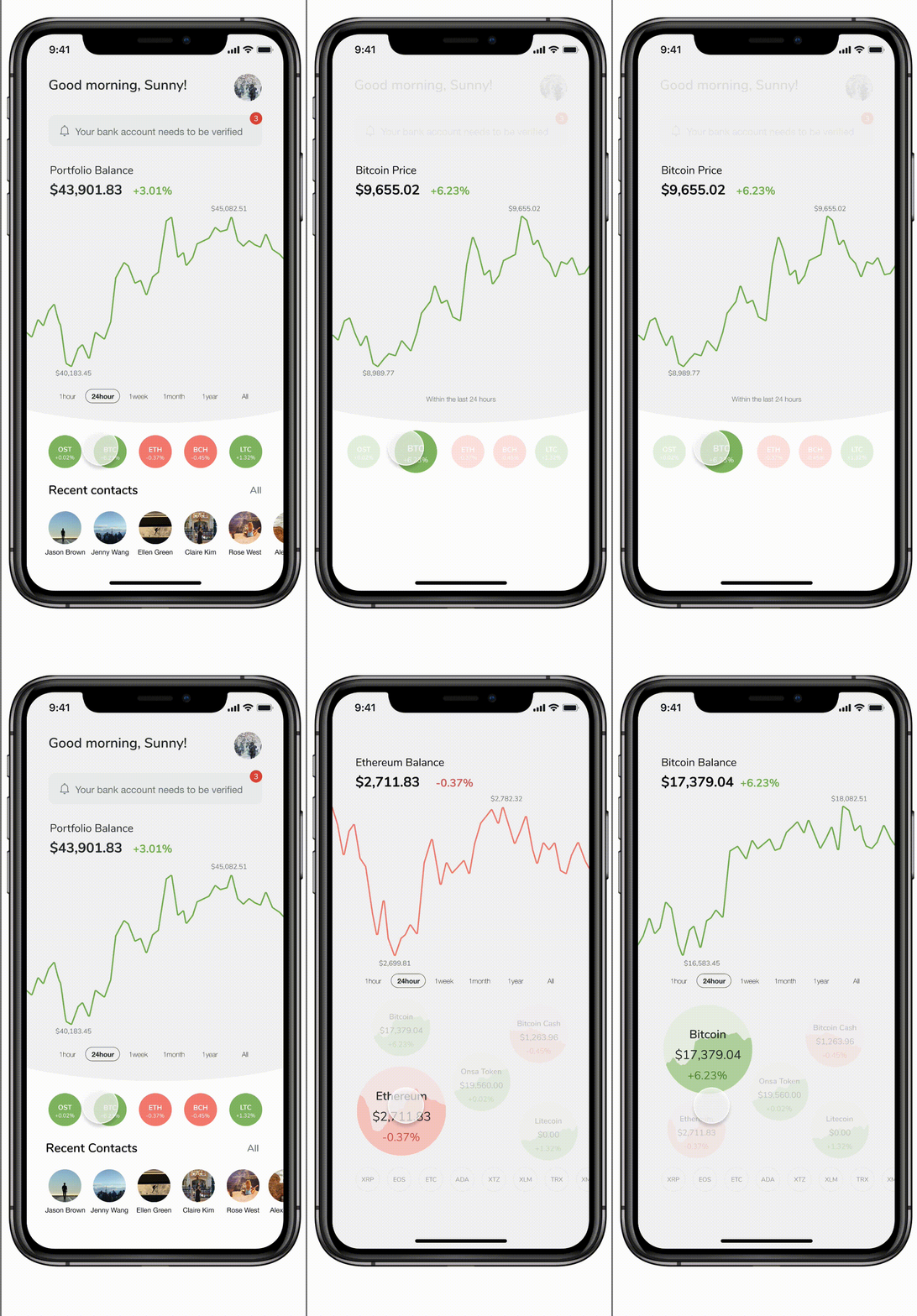
Check your Portfolio balance
Light version & Pro version of investment
Comparing different tokens
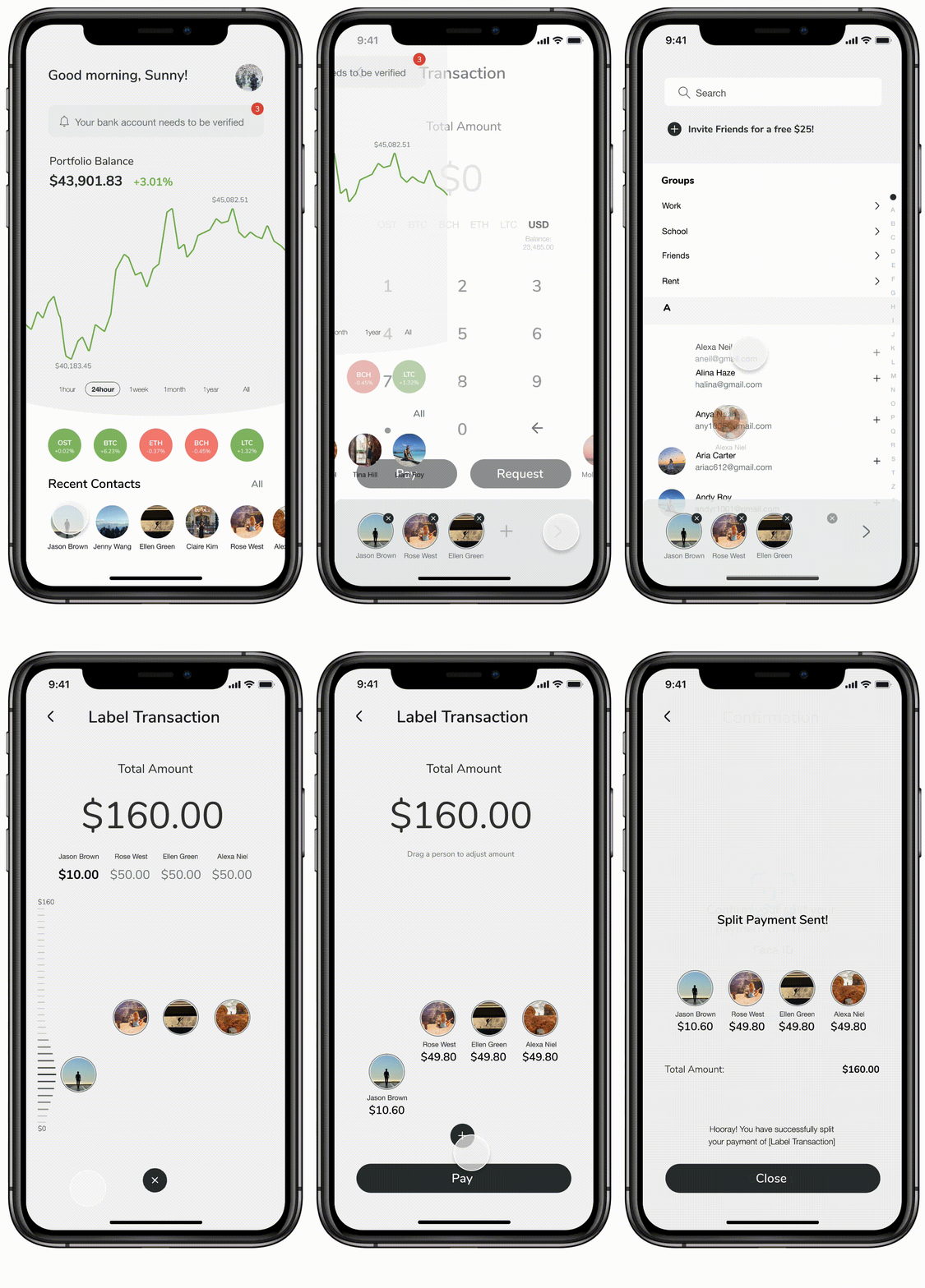
Fluid Peer to Peer transaction
Split Payment
Select and add peers by scrolling up and down
Responsive scale which reacts to thumb interaction
Send payment or request to multiple peers
GO BACK TO PROJECT PAGE